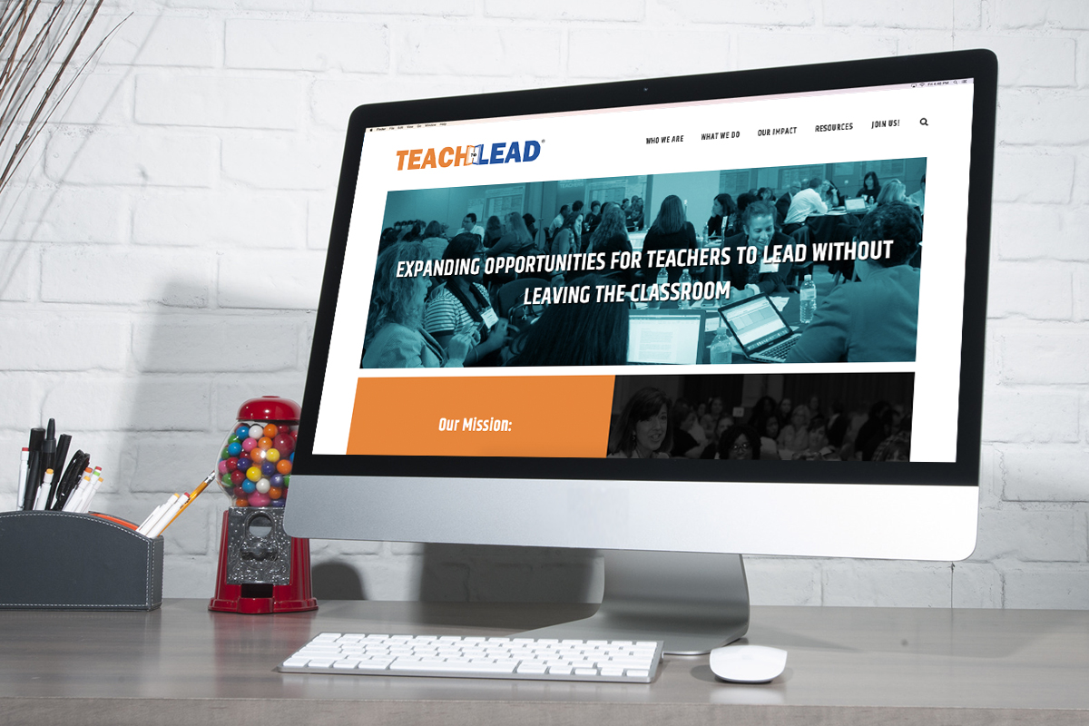
Navigation North partnered with Teach to Lead to launch a new website with improved user experience and a featured profiles tool.
Visual Facelift
During initial meetings with the Teach to Lead team, it was determined they wanted a more modern look and feel. They provided a few examples of nonprofit and education websites they liked, and we crafted a design together. A grid-like layout gave a contemporary aesthetic and provided seamless efforts to responsive display for mobile and tablet.
Previous website:

New website:

Improved User Experience & Journey
Teach to Lead staff addressed concerns regarding the dated appearance of their website. The design and content did not lead visitors to the most important information the agency provides. We improved user journeys to guide the audience to relevant information through direction in content rather than relying solely on navigation.
With this improved website structure, Google rankings will improve and the most important information will be highlighted to visitors. Leveraging open source resources available for WordPress CMS websites, our team provided more control to Teach to Lead for their metadata indexed by Google. After reviewing analytics and team goals, keywords were noted and added to descriptions and titles for improved search engine rankings.
Previous website:

New website:

[fusion_separator style_type=”none” hide_on_mobile=”small-visibility,medium-visibility,large-visibility” class=”” id=”” sep_color=”” top_margin=”20px” bottom_margin=”” border_size=”” icon=”” icon_circle=”” icon_circle_color=”” width=”” alignment=”center”][/fusion_separator]
[irp posts=”8098″ name=”Navigation North Project Earns 2017 Gold MUSE Award”]
[fusion_separator style_type=”none” hide_on_mobile=”small-visibility,medium-visibility,large-visibility” class=”” id=”” sep_color=”” top_margin=”20px” bottom_margin=”” border_size=”” icon=”” icon_circle=”” icon_circle_color=”” width=”” alignment=”center”][/fusion_separator]
Updated Profiles Tool
The website had an existing Stories tool, sharing information about Teach to Lead constituents and their projects.
Our shared goal was to emphasize featured Profiles and highlight the organization’s Summits. Leveraging the existing structure of the previously developed Navigation North Stories Tool, including updates to sorting and display options, allowed for impactful user experience improvements while being mindful of a limited budget for new development.
Previous website:

New website:

[fusion_separator style_type=”none” hide_on_mobile=”small-visibility,medium-visibility,large-visibility” class=”” id=”” sep_color=”” top_margin=”20px” bottom_margin=”” border_size=”” icon=”” icon_circle=”” icon_circle_color=”” width=”” alignment=”center”][/fusion_separator]
[irp posts=”7100″ name=”What Supports EdTech Project Success?”]
[fusion_separator style_type=”none” hide_on_mobile=”small-visibility,medium-visibility,large-visibility” class=”” id=”” sep_color=”” top_margin=”20px” bottom_margin=”” border_size=”” icon=”” icon_circle=”” icon_circle_color=”” width=”” alignment=”center”][/fusion_separator]
And the website looks great on a phone!

Is your educational agency looking to improve your website? Contact us today!
